Tag: Dashboard
All blog posts with this tag.
- 13 Jul, 2026
Monthly web reporting: build a report leadership will actually read
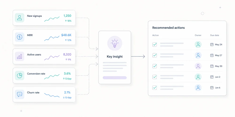
A web report can contain forty pages and produce no decision. Leadership rarely lacks charts. It lacks clear answers to five questions:What changed? Does it matter? Why do we think it changed? What action follows? Can we trust the data?Monthly reporting should be a decision document, not an archive of every available metric. A strong version has one main page, with appendices for investigation. It uses no more than five coherent indicators, contextualised changes and assigned actions. What monthly reporting is for A dashboard answers questions on demand. A monthly report establishes a shared reading at a point in time. It supports goals, detects gaps, explains known changes, records hypotheses, signals measurement limits and coordinates marketing, product, sales and engineering. It should not prove that the analytics team worked. Data volume is not decision quality. Start with the reader Leadership needs trend, target gap, business impact, risk, decision, owner and deadline. Operational teams need channel, page, campaign, event, segment, anomaly and methodology detail. Create two layers:decision summary; diagnostic appendices.The first must make sense without opening a dashboard. A seven-block format 1. One summary sentence Lead with the message, not total traffic. Example:Demo requests increased 18% on stable traffic, mainly through two organic landing pages. Lead quality still needs confirmation through the sales cycle.It contains result, comparison, likely mechanism and limitation. Avoid:The site recorded 42,847 sessions.Without a goal or comparison, the number says little. 2. Three to five KPIsMetric Month Change Target StatusQualified visits 18,240 +4% 18,000 MetDemo requests 126 +18% 120 MetVisit-to-demo rate 0.69% +0.08 pp 0.65% MetSales-accepted leads 61 +7% 70 BelowCollection incidents 2 +2 0 FixStatus follows a defined rule, not decorative colour. For B2B SaaS, the chain might be qualified audience, web conversion, sales quality, acquisition efficiency and measurement health. For content sites, use relevant organic entrances, useful engagement, product transition, signup and technical coverage. A portfolio can use the multi-site governance view as a common baseline with local metrics. 3. Significant changes Do not comment on every row. Select three to five movements above normal noise. Examples:conversions up 22% from one landing page; paid search down after budget reduction; direct traffic up on an untagged email campaign; Search Console impressions changed after a measurement or visibility shift; six hours of missing events; mobile improvement after a performance release.For each, record: Observation Magnitude Scope Hypothesis Evidence ConfidenceThis prevents correlation from becoming certainty. 4. Explanations and confidence Classify explanations:confirmed: documented deployment, budget change or outage; probable: several signals agree; possible: hypothesis to test; unknown: insufficient data.Example:Organic conversions probably increased because two pages gained both Search Console clicks and analytics entrances. Confidence: medium. Sales quality will be available after lead review.Confidence language is more honest than invented causality. 5. Decisions and actionsAction Owner Deadline Success measureApply the proof block to two product pages Content 25 July +10% conversion on tested pagesFix newsletter tagging Growth 15 July Direct share returns to normal on landing pageAudit event loss Engineering 10 July No collection gaps for 30 daysAn action without an owner is an intention. One without success criteria is a task without learning. 6. Data quality Add a visible box: Overall confidence: medium to high Known coverage: public site, excluding customer app Incidents: 6-hour loss on 12 June Changes: new CMP on 18 June Method break: qualified-lead definition changed 1 June Missing data: last 5 days of sales qualificationDo not hide quality in a footnote. Credibility improves when the report says what it does not know. 7. Appendices Appendices can cover sources, landing pages, campaigns, events, Search Console, web performance, segments, methodology, definition history and dashboard links. They support diagnosis, not the main reading. Choose five indicators Connect every KPI to a decision Ask what changes if the metric rises or falls. A metric with no possible action is probably descriptive. Define numerator and denominator A conversion rate can mean conversions per session, visitor, landing-page entry or started form. Write the formula and flag definition changes. Separate volume, efficiency and qualityvolume: demo requests; efficiency: conversion rate; quality: sales-accepted requests.Higher volume with lower quality is not automatically better. Add a reliability metric Examples include valid-event share, time without data, properties in error, consent coverage, unattributed traffic and CRM qualification delay. Measurement has its own performance. Compare the right periods Use previous month for operations, prior year for seasonality when comparable, target for relevance, and moving averages for low-volume trends. Two comparisons are usually enough: June 2026 vs May 2026 June 2026 vs monthly targetNormalise days, working days, time zone, currency, conversion definition, site scope, consent, campaigns and incidents. Use Search Console and analytics together Search Console and analytics observe different objects. Search Console reports Google search clicks and impressions under its rules. Analytics records visits or events collected on the site. Differences can result from incomplete page loads, consent, blocking, time zones, URL grouping, filters, bots and session definitions. Use triangulation:Search Console for visibility, queries and clicks; analytics for landing pages and on-site actions; CRM for quality and revenue.Do not force equality. Add web performance without overload Current Core Web Vitals cover:LCP for loading; INP for responsiveness; CLS for visual stability.Leadership reporting can show the share meeting expectations, trend, critical pages, release impact and action. Use field data where available for real-user experience, with laboratory tests for diagnosis. A one-page example Web performance, June 2026 Summary Demo requests increased 18% on stable traffic. Two organic pages explain most of the growth. Sales-accepted leads remain below target, limiting the conclusion on quality. KPIsKPI Result vs May TargetQualified visits 18,240 +4% 18,000Demos 126 +18% 120Conversion rate 0.69% +0.08 pp 0.65%Accepted leads 61 +7% 70Collection availability 99.2% -0.8 pp 100%Three facts/analytics-guide/ generated 21 demos versus 10 in May. Paid search fell 14% after budget reduction. Direct rose on an email landing page, probably because links lacked UTM tags.DecisionsApply the guide-page pattern to two product pages. Fix the newsletter link generator. Review lead qualification with sales.Data quality A six-hour collection incident affected 12 June. The latest five days of CRM qualification are incomplete. The page can be read in two minutes. Appendices answer follow-up questions. Automate preparation, not judgement Automate extraction, variation calculations, tables, freshness controls, alerts, definition snapshots and draft generation. Keep human review for selecting important facts, validating anomalies, stating hypotheses, assigning confidence and deciding actions. Automation does not know why a campaign stopped, a form changed or a lead category has different value. A monthly calendar Day 1: data checks Verify freshness, incidents, definitions and imports. Day 2: analysis Identify movements, triangulate and prepare hypotheses. Day 3: operational review Marketing, product and sales confirm known changes. Day 4: publication Send the summary with actions. Mid-month: follow-up Check decisions before the next report. The exact schedule can be faster. Keep control, analysis and validation separate. Mistakes that make reporting useless Showing everything An exhaustive report prioritises nothing. Commenting only on growth Growth can remain below target or come from low-quality channels. Hiding incidents They will surface later and undermine the whole report. Claiming attribution without evidence “The campaign caused the increase” needs more than timing. Changing KPIs every month Continuity disappears. Change metrics when strategy changes and record the transition. Reporting team activity rather than outcomes “Ten articles published” is activity. Qualified entries and conversions from content are outcomes, still requiring cautious interpretation. Conclusion A useful monthly report has seven blocks:summary; KPIs; changes; explanations and confidence; actions; data quality; appendices.It keeps leadership informed without hiding complexity. It makes uncertainty visible, connects numbers to targets and assigns every conclusion to an action. Five well-defined indicators reviewed consistently beat fifty ownerless charts. FAQ How long should a monthly report be? The main summary can fit on one page. Appendices may be longer but should remain optional for leadership. PDF or dashboard link? Use a dated summary with access to detail. A short email or document plus dashboard link often works better than an exhaustive export. How many KPIs? Three to five primary KPIs are usually enough. Keep diagnostics in appendices. How should uncertain data be presented? State the limitation, possible cause and confidence. Do not replace missing data with a confident story. Previous month or previous year? Use previous month for operations and previous year for seasonality when scopes are comparable. Target variance is often the most useful comparison. SourcesGoogle Analytics, Reports overview Google Search Console, Performance report web.dev, Web Vitals Google Analytics, Landing page report Google Analytics, Traffic-source dimensions
- 12 Jan, 2026
The "Less is More" Method: 5 Metrics Are All You Need to Run a Profitable Website
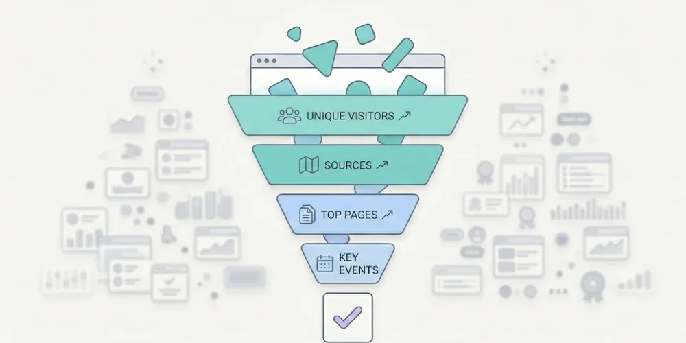
Opening your web analytics tool often feels like popping the hood of a modern car without being a mechanic: you can see it's complex, you hope everything's working, but you have no idea what to touch. That's normal. According to Eurostat, 44% of Europeans lack basic digital skills. It's not your fault if you can't make sense of your traffic reports — it's because the tools are designed for experts, not for business owners. → Source: Eurostat – Digital skills of individuals The good news? To grow your business, you don't need to become an expert. You just need to apply the Pareto principle: ignore 80% of the noise and focus on the 20% of metrics that impact your revenue.1. Why Measuring Everything Means Measuring Nothing The classic SMB mistake is thinking: "I'll record everything just in case." The result is a "Christmas tree" dashboard: bounce rate, average session duration, pages per visit, user flows, predefined events, real-time reports… When everything blinks, nothing matters. We've detailed this phenomenon in our article on data obesity: information overload produces paralysis, not decisions. Choice overload applies to metrics too. To adopt a frugal approach, filter your data with one question: "If this number changed tomorrow, would I change how I work?"If the answer is no → it's noise. Remove it from your dashboard. If the answer is yes → it's a KPI (Key Performance Indicator). Keep it.When you apply this filter rigorously, nearly every SMB arrives at the same 5 metrics. No more, no less.2. The Only 5 Metrics You Need Here's the ideal setup for a brochure site, a blog, or a small online store. These 5 KPIs cover the entire visitor journey: from discovery to conversion. KPI 1 — Unique Visitors (Your Real Audience) The number of distinct people who visited your site over a given period (not clicks, not "sessions" — people).The business question: "Is my audience growing? Are more people finding me?" Reading frequency: Weekly. Compare week over week to see the trend, not day by day (daily fluctuations are noise). The trap: Don't confuse "unique visitors" and "pageviews." If one person visits 10 pages, that's 1 visitor and 10 pageviews. It's the visitor count that measures your actual reach.KPI 2 — Traffic Sources (Where Do They Come From?) How your audience breaks down by channel: Google (SEO), social media, direct access, email, paid ads, referrals.The business question: "Where should I invest my time and money?" Why it's critical: According to Eurostat, 60% of EU businesses are on social media, but many are flying blind. This metric tells you whether the hours spent on LinkedIn, Instagram, or TikTok are actually paying off — or if SEO is doing the real work. The trap: Make sure your campaigns are tagged with UTMs. Without UTMs, traffic from your newsletters, social posts, or ad campaigns gets bucketed into "Direct" or "Referral," which corrupts your analysis.→ Source: Eurostat – Social media use by enterprises KPI 3 — Top 5 Pages (What Actually Interests People) Your 5 most visited pages, ranked by unique visitors.The business question: "What topics attract my prospects?" What you often discover: The "Service A" page (the one you spent weeks on) never gets read, while an old blog post or FAQ page attracts everyone. These surprises are gold: they tell you what your market actually wants to know. How to act: If a page attracts lots of traffic but doesn't convert, add a clear call-to-action. If a page converts well but has little traffic, invest in promotion (SEO, social, paid).KPI 4 — Key Events (Engagement) The concrete actions visitors take: clicking "Call," downloading a PDF, watching a video, adding to cart.The business question: "Is my site engaging, or are people just passing through?" Why this beats "engagement rate": GA4's automatic metrics (engagement rate, session duration) are ambiguous and hard to interpret. An explicit event ("clicked the Quote button") is crystal clear and directly tied to business value. How to set up: Most frugal analytics tools let you define custom events in a few clicks, with no Tag Manager required. Identify the 3-5 actions that matter on your site and track only those.KPI 5 — Conversions (The Bottom Line) The number of forms submitted, calls triggered, or sales completed. This is the only number that matters at the end of the month.The business question: "How much revenue did this site generate this week?" The trap: Many sites don't track conversions at all. The contact form sends an email, but nobody counts how many forms are submitted per week. Without this data, you can't tell whether your site is a profitable investment or a cost center. How to set up: Define a "goal" in your analytics tool (form submission, "Buy" button click, confirmation page visit). It's the most important metric and often the simplest to implement.3. The Minimalist Dashboard Here's what your weekly review should look like. One table, 5 rows, 2 minutes of reading.KPI This Week Last Week TrendUnique visitors 1,230 1,050 ✅ +17%Top source Google (62%) Google (58%) ✅ SEO growingTop page /blog/gdpr-article /services ℹ️ New content performingKey events 45 "Quote" clicks 38 ✅ +18%Conversions (forms) 12 9 ✅ +33%Reading time: 30 seconds. Possible decision: "SEO and blog content are working — keep going. Form submissions are up — no need to change the contact page." That's it. No charts to interpret, no segments to configure. If you're a freelancer or agency, this is also the perfect basis for effective client reporting.4. Quick Diagnosis: How to Act This diagnostic table covers the most common scenarios. Find your situation and apply the recommendation.Scenario Diagnosis ActionLots of visitors (#1) but few conversions (#5) Your offer isn't clear, or your form is off-putting Simplify the contact page (fewer fields). Add a visible CTA on high-traffic pages.Few visitors (#1) but high conversion rate (#5) Your site converts well, but nobody can find it Invest in acquisition: SEO (content), targeted ads, or social media. The site is ready.High social traffic (#2) but few conversions (#5) You're attracting "tourists" who aren't your target Shift your social content strategy to attract prospects, not just curious browsers. Or accept that social serves awareness, not conversion.Top page = homepage (#3) and nothing else Visitors aren't going deeper Your navigation is confusing or your internal content isn't compelling. Improve internal linking and CTAs.Many "Quote" clicks (#4) but few form submissions (#5) The form is too long or broken Test the form yourself on mobile. Reduce the number of fields. Check it works across browsers.Traffic dropped for 2 weeks Technical or seasonal issue Check Search Console (indexing errors?). Check your analytics script (still installed?). If everything's fine, it's likely seasonal — compare to the previous year.One blog post dominates the Top 5 (#3) That topic interests your market Create more content on this subject. Add a relevant CTA to that article. Offer a lead magnet (PDF, newsletter) to readers.5. Metrics to Ignore (and Why) For completeness, here are the indicators you can safely remove from your dashboard. Bounce rate. If a visitor arrives on your contact page, finds your phone number in 10 seconds, and calls, they "bounced" — but that's a total success. Bounce rate measures a technical behavior, not a business outcome. Since GA4, it's been replaced by "engagement rate," an equally ambiguous metric. Average session duration. A visitor who spends 8 minutes on your site — are they fascinated or lost? Impossible to tell without context. This metric is a classic vanity metric. Pages per session. Same problem. More pages = better engagement? Or confusing navigation? The number alone tells you nothing. Demographic data (age, gender). In many analytics stacks, these data points rely on profiling or advertising features that trigger consent and privacy review. And in the vast majority of cases, they do not change an SMB's business decisions.6. Reading Frequency: The Discipline of Simplicity Running a website shouldn't take more than 15 minutes per week.Weekly: Check your 5 KPIs. Identify one trend and one action. Monthly: Compare this month to last month. Prepare the client report if you're at an agency. Quarterly: Zoom out. Are traffic sources shifting? Are conversions trending up? Should you adjust strategy?The temptation to avoid: checking stats every day. Daily fluctuations are statistical noise. 200 visitors on Monday and 150 on Tuesday means nothing. Only the weekly or monthly trend matters.Conclusion: The Discipline of Simplicity Go back to the fundamentals. Print this list of 5 KPIs, configure your tool to show only these, and ignore the rest. If your current tool can't deliver these 5 answers in under 30 seconds, it might be time for a change. Our analytics tool comparison can help you choose. Analytics shouldn't be a chore. It's a decision tool — and like any good tool, it should be simple to use.FAQ: Essential Metrics Should I track the "Bounce Rate"? No. If a visitor arrives, finds your phone number in 10 seconds, and calls, they "bounced" technically — but it's a business success. Bounce rate doesn't distinguish a satisfied visitor from a disappointed one. Focus on conversions (KPI #5), which measure the actual result. How often should I check my stats? Once a week, 10-15 minutes maximum. Checking every day creates unnecessary anxiety over fluctuations that have no statistical significance. Trends are read over weeks, not days. Are these 5 KPIs enough for e-commerce? For a small e-commerce site (under 500 orders/month), yes. KPI #5 (Conversions) becomes "Number of sales + Revenue." For larger e-commerce with multi-channel attribution needs, you'll want additional metrics (average order value, cart abandonment rate, cost per acquisition by channel). How do I set up conversion tracking without Tag Manager? Most frugal analytics tools offer built-in event tracking: you define a CSS selector (e.g., "click on the .btn-contact button") directly in the interface, with no code or Tag Manager required. Check your tool's documentation for the exact procedure. My boss wants a report with 20 metrics. How do I convince them? Send them the 5 KPI table for 4 weeks, adding a "Recommendation of the Week" line based on these metrics alone. When they realize they make better decisions with 5 metrics than with 20, the debate is over. The ultimate test: ask them to name the 20 metrics from memory. If they can't, they don't need them.