Monthly web reporting: build a report leadership will actually read
- 13 Jul, 2026
A web report can contain forty pages and produce no decision.
Leadership rarely lacks charts. It lacks clear answers to five questions:
- What changed?
- Does it matter?
- Why do we think it changed?
- What action follows?
- Can we trust the data?
Monthly reporting should be a decision document, not an archive of every available metric.
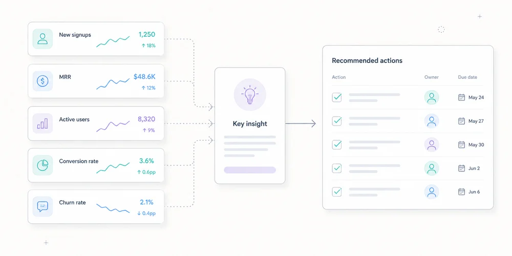
A strong version has one main page, with appendices for investigation. It uses no more than five coherent indicators, contextualised changes and assigned actions.
What monthly reporting is for
A dashboard answers questions on demand. A monthly report establishes a shared reading at a point in time.
It supports goals, detects gaps, explains known changes, records hypotheses, signals measurement limits and coordinates marketing, product, sales and engineering.
It should not prove that the analytics team worked. Data volume is not decision quality.
Start with the reader
Leadership needs trend, target gap, business impact, risk, decision, owner and deadline.
Operational teams need channel, page, campaign, event, segment, anomaly and methodology detail.
Create two layers:
- decision summary;
- diagnostic appendices.
The first must make sense without opening a dashboard.
A seven-block format
1. One summary sentence
Lead with the message, not total traffic.
Example:
Demo requests increased 18% on stable traffic, mainly through two organic landing pages. Lead quality still needs confirmation through the sales cycle.
It contains result, comparison, likely mechanism and limitation.
Avoid:
The site recorded 42,847 sessions.
Without a goal or comparison, the number says little.
2. Three to five KPIs
| Metric | Month | Change | Target | Status |
|---|---|---|---|---|
| Qualified visits | 18,240 | +4% | 18,000 | Met |
| Demo requests | 126 | +18% | 120 | Met |
| Visit-to-demo rate | 0.69% | +0.08 pp | 0.65% | Met |
| Sales-accepted leads | 61 | +7% | 70 | Below |
| Collection incidents | 2 | +2 | 0 | Fix |
Status follows a defined rule, not decorative colour.
For B2B SaaS, the chain might be qualified audience, web conversion, sales quality, acquisition efficiency and measurement health.
For content sites, use relevant organic entrances, useful engagement, product transition, signup and technical coverage.
A portfolio can use the multi-site governance view as a common baseline with local metrics.
3. Significant changes
Do not comment on every row. Select three to five movements above normal noise.
Examples:
- conversions up 22% from one landing page;
- paid search down after budget reduction;
- direct traffic up on an untagged email campaign;
- Search Console impressions changed after a measurement or visibility shift;
- six hours of missing events;
- mobile improvement after a performance release.
For each, record:
Observation
Magnitude
Scope
Hypothesis
Evidence
Confidence
This prevents correlation from becoming certainty.
4. Explanations and confidence
Classify explanations:
- confirmed: documented deployment, budget change or outage;
- probable: several signals agree;
- possible: hypothesis to test;
- unknown: insufficient data.
Example:
Organic conversions probably increased because two pages gained both Search Console clicks and analytics entrances. Confidence: medium. Sales quality will be available after lead review.
Confidence language is more honest than invented causality.
5. Decisions and actions
| Action | Owner | Deadline | Success measure |
|---|---|---|---|
| Apply the proof block to two product pages | Content | 25 July | +10% conversion on tested pages |
| Fix newsletter tagging | Growth | 15 July | Direct share returns to normal on landing page |
| Audit event loss | Engineering | 10 July | No collection gaps for 30 days |
An action without an owner is an intention. One without success criteria is a task without learning.
6. Data quality
Add a visible box:
Overall confidence: medium to high
Known coverage: public site, excluding customer app
Incidents: 6-hour loss on 12 June
Changes: new CMP on 18 June
Method break: qualified-lead definition changed 1 June
Missing data: last 5 days of sales qualification
Do not hide quality in a footnote. Credibility improves when the report says what it does not know.
7. Appendices
Appendices can cover sources, landing pages, campaigns, events, Search Console, web performance, segments, methodology, definition history and dashboard links.
They support diagnosis, not the main reading.
Choose five indicators
Connect every KPI to a decision
Ask what changes if the metric rises or falls. A metric with no possible action is probably descriptive.
Define numerator and denominator
A conversion rate can mean conversions per session, visitor, landing-page entry or started form. Write the formula and flag definition changes.
Separate volume, efficiency and quality
- volume: demo requests;
- efficiency: conversion rate;
- quality: sales-accepted requests.
Higher volume with lower quality is not automatically better.
Add a reliability metric
Examples include valid-event share, time without data, properties in error, consent coverage, unattributed traffic and CRM qualification delay.
Measurement has its own performance.
Compare the right periods
Use previous month for operations, prior year for seasonality when comparable, target for relevance, and moving averages for low-volume trends.
Two comparisons are usually enough:
June 2026 vs May 2026
June 2026 vs monthly target
Normalise days, working days, time zone, currency, conversion definition, site scope, consent, campaigns and incidents.
Use Search Console and analytics together
Search Console and analytics observe different objects.
Search Console reports Google search clicks and impressions under its rules. Analytics records visits or events collected on the site. Differences can result from incomplete page loads, consent, blocking, time zones, URL grouping, filters, bots and session definitions.
Use triangulation:
- Search Console for visibility, queries and clicks;
- analytics for landing pages and on-site actions;
- CRM for quality and revenue.
Do not force equality.
Add web performance without overload
Current Core Web Vitals cover:
- LCP for loading;
- INP for responsiveness;
- CLS for visual stability.
Leadership reporting can show the share meeting expectations, trend, critical pages, release impact and action. Use field data where available for real-user experience, with laboratory tests for diagnosis.
A one-page example
Web performance, June 2026
Summary
Demo requests increased 18% on stable traffic. Two organic pages explain most of the growth. Sales-accepted leads remain below target, limiting the conclusion on quality.
KPIs
| KPI | Result | vs May | Target |
|---|---|---|---|
| Qualified visits | 18,240 | +4% | 18,000 |
| Demos | 126 | +18% | 120 |
| Conversion rate | 0.69% | +0.08 pp | 0.65% |
| Accepted leads | 61 | +7% | 70 |
| Collection availability | 99.2% | -0.8 pp | 100% |
Three facts
/analytics-guide/generated 21 demos versus 10 in May.- Paid search fell 14% after budget reduction.
- Direct rose on an email landing page, probably because links lacked UTM tags.
Decisions
- Apply the guide-page pattern to two product pages.
- Fix the newsletter link generator.
- Review lead qualification with sales.
Data quality
A six-hour collection incident affected 12 June. The latest five days of CRM qualification are incomplete.
The page can be read in two minutes. Appendices answer follow-up questions.
Automate preparation, not judgement
Automate extraction, variation calculations, tables, freshness controls, alerts, definition snapshots and draft generation.
Keep human review for selecting important facts, validating anomalies, stating hypotheses, assigning confidence and deciding actions.
Automation does not know why a campaign stopped, a form changed or a lead category has different value.
A monthly calendar
Day 1: data checks
Verify freshness, incidents, definitions and imports.
Day 2: analysis
Identify movements, triangulate and prepare hypotheses.
Day 3: operational review
Marketing, product and sales confirm known changes.
Day 4: publication
Send the summary with actions.
Mid-month: follow-up
Check decisions before the next report.
The exact schedule can be faster. Keep control, analysis and validation separate.
Mistakes that make reporting useless
Showing everything
An exhaustive report prioritises nothing.
Commenting only on growth
Growth can remain below target or come from low-quality channels.
Hiding incidents
They will surface later and undermine the whole report.
Claiming attribution without evidence
“The campaign caused the increase” needs more than timing.
Changing KPIs every month
Continuity disappears. Change metrics when strategy changes and record the transition.
Reporting team activity rather than outcomes
“Ten articles published” is activity. Qualified entries and conversions from content are outcomes, still requiring cautious interpretation.
Conclusion
A useful monthly report has seven blocks:
- summary;
- KPIs;
- changes;
- explanations and confidence;
- actions;
- data quality;
- appendices.
It keeps leadership informed without hiding complexity. It makes uncertainty visible, connects numbers to targets and assigns every conclusion to an action.
Five well-defined indicators reviewed consistently beat fifty ownerless charts.
FAQ
How long should a monthly report be?
The main summary can fit on one page. Appendices may be longer but should remain optional for leadership.
PDF or dashboard link?
Use a dated summary with access to detail. A short email or document plus dashboard link often works better than an exhaustive export.
How many KPIs?
Three to five primary KPIs are usually enough. Keep diagnostics in appendices.
How should uncertain data be presented?
State the limitation, possible cause and confidence. Do not replace missing data with a confident story.
Previous month or previous year?
Use previous month for operations and previous year for seasonality when scopes are comparable. Target variance is often the most useful comparison.