- 06 Apr, 2026
Why your Search Console impressions may drop in April 2026 without your SEO getting worse
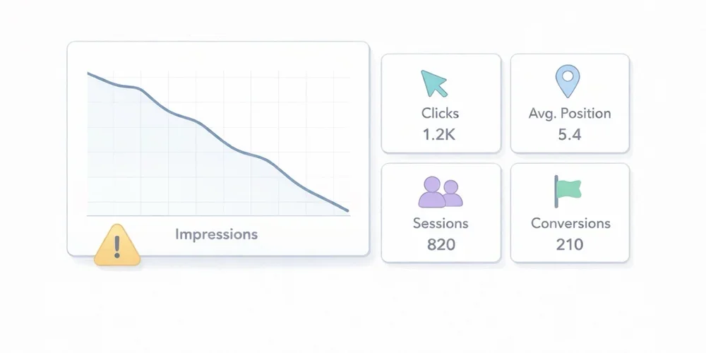
In April 2026, Google added and then updated an official note on the Search Console data anomalies page. The message is simple, but its consequences can create a lot of false alarms in SEO dashboards: a logging issue prevented Search Console from accurately reporting impressions from May 13, 2025 until April 27, 2026. Google now says the issue has been resolved. In practice, many teams will see impressions drop in Search Console without seeing an equivalent drop in real-world search visibility. And because the interface also shows average CTR and average position, correcting impression counts can move several metrics at once even when actual SEO performance has not materially changed. For a small or midsize business, a marketing team, or an agency, this is exactly the kind of moment when bad diagnosis becomes expensive. You think you are seeing a ranking problem, you trigger an emergency review, you rewrite pages that were fine, and only later realize the original signal was partly a measurement artifact. This article has a simple goal: explain what Google actually announced, clarify which metrics deserve more trust after this correction, and give you a more resilient way to read your SEO data. What Google actually said The note Google published on April 3, 2026 highlights four important points. First, this is a logging issue in Search Console. Google is not saying that a ranking change or search delivery issue affected the live search results. It is saying that impression reporting inside the tool was not being recorded accurately. Second, Google dates the start of the issue to May 13, 2025. That matters because it means recent historical reporting for many properties may have been affected for almost a year. Third, Google now says the issue has been resolved. The operational reading is therefore to compare periods before and after April 27, 2026 carefully, rather than looking for an immediate SEO cause behind every impression break. Fourth, Google states that only impressions and related metrics, such as CTR and average position, were affected. Clicks were not affected by the error. This is probably the most useful operational takeaway. If clicks remain the most reliable signal, then the correct response to falling impressions is not panic. It is a change in analytical priorities. Why lower impressions do not automatically mean worse SEO In Search Console, an impression reflects that your property was shown in Google Search according to the tool’s reporting rules. The Performance report also includes clicks, average CTR, and average position. The key point is this: if impressions were overstated or logged incorrectly and are now being corrected, a visible drop in the chart may simply reflect a return to more accurate measurement. It does not automatically mean your pages are being shown less often in Google Search. That is especially true if, at the same time:clicks remain stable; average position shows no break confirmed by clicks; organic Google traffic in your analytics tool does not break down; SEO-driven conversions do not show a clear structural drop.In other words, you need to separate measurement correction from performance deterioration. That distinction matters because many teams have learned to treat impressions as a universal leading indicator. In this case, Google explicitly says the issue affected impression logging, not clicks. If your reporting logic is built around impressions without context, you can easily mistake a reporting fix for an SEO problem. The average CTR trap Average CTR deserves extra caution. In Search Console, CTR is calculated from clicks and impressions. If Google corrects impressions downward while clicks remain unchanged, CTR can rise mechanically. That means a higher CTR will not necessarily signal better snippets, stronger intent alignment, or better SEO execution. It may simply reflect the corrected denominator. This is where automated dashboards can tell a very persuasive but very false story:impressions are down; CTR is up; therefore traffic must be more qualified.That conclusion may be completely wrong. Around the resolution period, CTR should be treated as a derived metric that needs context, not as immediate proof of improvement or decline. Which metrics to trust first When one metric becomes unstable, the right move is to anchor analysis in the most robust signals. In this situation, here is the reading order I recommend. 1. Search Console clicks Because Google says clicks were not affected, they become the primary anchor. Review them at several levels:whole property; strategic directories; key pages; comparable groups of pages.You are not looking for one odd day. You are looking for a real break in trend. 2. Average position, with nuance Google says average position is one of the impression-related metrics that was affected. Do not treat it as a perfectly stable independent signal. It is still useful context, but it should be read alongside clicks, pages, and queries. Operationally, use it to answer a simple question: are you seeing a real decline confirmed by clicks and critical pages, or only an impression change tied to the reporting correction? 3. Google organic traffic in your analytics tool Search Console measures what happens before the click in Google Search. Your analytics tool measures what happens after the visit reaches your site. Those are different views, which is exactly why they are complementary. If Search Console shows lower impressions while your Google organic traffic remains stable in analytics, that is a strong argument against the idea of a real SEO drop. For most marketing teams, this is the most useful cross-check. A reporting correction upstream does not necessarily create any business impact downstream. 4. Organic conversions For many businesses, this is the real red line. If forms, trials, demo requests, downloads, or revenue attributed to organic search remain stable, you should avoid overreacting to a single impression series. Conversely, if clicks, organic traffic, and conversions all decline together, you probably do have a real issue worth investigating. The right way to read after the resolution Here is a simple process that is strong enough for an SMB or an agency. Step 1: freeze fast conclusions about impressions Around the corrected period, avoid statements like:“Our visibility is collapsing” “Google is showing us less” “The content we published in January is underperforming” “The redesign broke SEO”Those conclusions may turn out to be true, but impressions alone are no longer enough to support them cleanly. Step 2: extend comparison windows A 7-day versus 7-day comparison becomes more fragile when a metric has just been corrected. Prefer:28 days versus 28 days; rolling 8-week views; calendar months if your volume supports it.The goal is to reduce noise and avoid reacting to a purely technical movement. Step 3: segment before you interpret Review separate views for:business-critical pages; blog content; documentation; branded versus non-branded traffic; important countries or devices if volume is large enough.A broad measurement issue does not always appear identically across every segment. And a real SEO issue often leaves a more localized signature. Step 4: reconcile Search Console and analytics Build a simple cross-check:Search Console clicks Google organic sessions Organic conversions Average position on critical page setsIf the four lines tell the same story, you can act with confidence. If only the impression line diverges, caution is warranted. Step 5: document the anomaly in reports If you work with teammates or clients, add a note to dashboards and monthly reports. One sentence is enough:In April 2026, Google reported a logging issue affecting Search Console impressions from May 13, 2025 until April 27, 2026. According to Google, only impressions and related metrics such as CTR and average position were affected; clicks were not. Impression changes around this period should be interpreted carefully.This small note can prevent a surprising amount of confusion. What not to do When data moves, the classic mistake is to act too fast. These are the reflexes to avoid. Do not rewrite titles and meta descriptions at scale after the first drop in impressions Yes, snippets can influence CTR. But in the current context, if the drop comes from a reporting correction, you may be changing pages that were never the problem. Do not launch an emergency technical audit without converging evidence A technical audit makes sense if several signals deteriorate together, or if you also see indexing, coverage, crawl, or site quality issues. An isolated impression drop is not enough. Do not over-interpret short-term winners and losers During a correction period, weekly top gainers and losers can become misleading. A page that “lost” impressions may not have lost actual search visibility. Do not confuse reporting trend with business trend This is probably the most important point. To manage a website, you need to separate:a metric that describes potential exposure; a metric that describes actual visits; a metric that describes useful action.Impressions matter, but they do not fill a sales pipeline on their own. What this news reminds us about SEO measurement This story is useful beyond the Google announcement itself. It highlights three broader principles. 1. No reporting tool is raw reality Search Console is extremely valuable, but it is still a reporting system with its own rules, aggregations, limits, and occasional anomalies. Numbers always need context. 2. Good reporting should survive an anomaly in a single tool If your whole SEO diagnosis depends on one impression chart, your reading is too fragile. A resilient setup should at least cross-check visibility, traffic, and business outcomes. 3. Teams should favor metrics that support decisions This is simple but often forgotten: out of all the available metrics, which ones actually help you decide what to do next? In this case, clicks, organic sessions, and conversions are often more decision-useful than raw impressions. What I recommend to teams, agencies, and SMBs right now Here is the short version. After this resolution, keep using Search Console, but do not treat impressions as the only alert metric for the affected periods. Move clicks to the top of the stack, keep average position as context, and always validate the diagnosis with analytics and conversions. For an SMB, the best posture is not to ignore Search Console. It is to put Search Console back in its proper place inside a simpler measurement system. Search Console tells you how Google exposes your pages. Your analytics tool tells you what visitors actually do after the click. Both matter, but they do not answer the same question. If you want a more stable acquisition view, this is also a good moment to review your SEO dashboards and limit executive reporting to the metrics that clearly support decisions. For a broader take on choosing a readable analytics setup, you can also read our guide: Google Analytics, Matomo or privacy-first analytics? The complete guide for 2026. Conclusion The impression drop many sites will notice in April 2026 should not be read automatically as an SEO decline. Google itself reported a logging issue affecting Search Console impressions from May 13, 2025 until April 27, 2026, now marked as resolved. In that context, the right response is not panic. It is a more disciplined reading model:clicks first; average position as context; organic traffic and conversions to validate real impact.In SEO, as in analytics, the biggest risk is not always poor performance. Sometimes it is poor diagnosis. FAQ Why are my Search Console impressions suddenly dropping in April 2026? Because Google reported in April 2026 that a logging issue had affected impression reporting from May 13, 2025 until April 27, 2026. Its resolution can produce a visible drop in impressions without reflecting a real SEO decline. Are Search Console clicks reliable during this correction? According to Google, yes. The official note says clicks were not affected by the error. That makes clicks the most useful metric to prioritize during this period. My CTR is increasing while impressions are falling. Is that good news? Not necessarily. Because CTR is calculated from clicks and impressions, a lower impression count with stable clicks can increase CTR mechanically. That is not automatic evidence of improvement. Should I change my SEO pages right away? Not based on impressions alone. Before making changes, also review clicks, average position, organic traffic in your analytics tool, and SEO-driven conversions. What is the best way to track real business impact? Cross-check Search Console with your analytics setup. If clicks, Google organic sessions, and conversions remain stable, you are more likely looking at a reporting correction than a real SEO problem. Sources Sources checked on May 10, 2026.Google Search Console Help, Data anomalies in Search Console Google Search Console Help, What are impressions, position, and clicks? Google Search Console Help, Performance report (Search results) Google Search Central, Using Search Console and Google Analytics Data for SEO
Read article →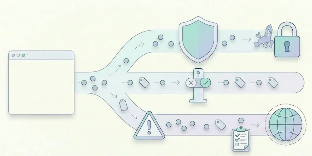
- 30 Mar, 2026
CNIL sanctions: what analytics teams should learn before launch
CNIL sanction decisions are useful because they show patterns, not just headline amounts. For analytics teams, the lesson is clear: risk rarely comes from measuring traffic in itself. It comes from unclear purposes, tracking before a valid choice, excessive collection, weak information, poor retention and provider relationships that nobody has reviewed. This article does not try to predict a fine. It gives product, marketing and legal teams a launch checklist grounded in the CNIL's public sanction list and cookie guidance. The recurring analytics risks 1. Tracking starts too early If advertising, personalization or advanced tracking fires before the visitor's valid choice is recorded, the compliance issue is immediate. Teams should verify scripts in the browser, not only in a tag manager diagram. 2. The purpose is too broad "Analytics" can hide several purposes: audience measurement, ad attribution, retargeting, product analytics, support, personalization and CRM enrichment. These purposes do not carry the same risk or consent analysis. They must be separated in configuration and documentation. 3. Data is kept too long Retention is a recurring sanction theme across CNIL decisions. Analytics teams should define retention for raw events, derived reports, exports and backups. The answer cannot be "as long as the tool allows". 4. Provider roles are unclear The site publisher remains responsible for understanding what the provider does. Review data-processing terms, hosting, transfers, sub-processors and reuse clauses before launch. 5. The public explanation is vague A privacy policy that only says "we use cookies to improve the experience" is not enough for a modern analytics stack. Explain the tool, purpose, data categories, retention and choice mechanism in concrete terms. How to reduce risk before launch Run this practical check:open a clean browser profile and inspect which scripts fire before any choice; map each tag to a purpose and owner; remove tags nobody can justify; separate minimal audience reporting from richer marketing tracking; document retention and export rules; review provider terms and transfer mechanisms; update privacy copy with actual tool names; keep evidence of the test in the release checklist.For Pomelo, this means keeping the public promise conservative: cookieless by default, minimal collection, clear documentation, Strict first and Extended by explicit configuration. Why this matters for SMEs SMEs often assume enforcement only targets large platforms. The CNIL sanction list shows that smaller organizations can also be sanctioned, including through simplified procedures. The amounts differ, but the operational lesson is the same: a small team still needs traceability, minimization and a clean release process. Good analytics governance is not bureaucracy. It prevents last-minute launches from becoming privacy incidents. Sources Sources checked on May 9, 2026.CNIL, public list of sanctions, updated April 14, 2026 CNIL, Cookies and other trackers CNIL, Cookies and audience measurement solutions
- 23 Mar, 2026
GDPR analytics checklist: 10 checks before installing a tracking tool
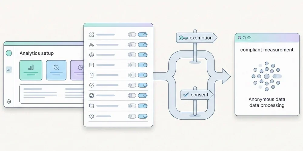
Installing analytics is easy. Governing analytics is harder. A script can be live in five minutes, but the team still needs to know what it collects, why it collects it, how long the data stays available and which choices are presented to visitors. Use this checklist before adding or changing a measurement tool. It is not legal advice. It is a practical review framework for product, marketing, engineering and privacy stakeholders. 1. Define the purpose Write the purpose in one sentence. "Understand audience and site performance" is not the same as advertising attribution, retargeting, product behavior analysis or CRM enrichment. Separate the purposes before discussing tools. 2. Split baseline and enriched collection Define what belongs in minimal audience reporting and what belongs in enriched tracking. Campaign parameters, detailed events, goals, technical context and multi-site segmentation should be deliberate configuration choices. 3. List the fields collected Review the payload, not only the dashboard. Check URL, referrer, user agent, language, screen data, campaign parameters, identifiers, events and custom properties. Remove fields that do not serve the stated purpose. 4. Check tracker timing Use a clean browser profile and inspect which scripts fire before any visitor choice is recorded. Do this on the homepage, landing pages, forms, checkout or signup flows and authenticated areas. 5. Set retention rules Define retention for raw events, aggregated reports, exports and backups. Long retention should be justified by a real operational need, not by a vendor default. 6. Review provider terms Confirm the provider role, hosting location, sub-processors, transfers, support access and reuse clauses. Keep the current data-processing agreement with the launch record. 7. Update public information Your privacy policy should name the tool, describe the purpose, list the main data categories, explain retention and point to the relevant choice or objection mechanism. 8. Test Strict and Extended behavior If your product separates Strict and Extended collection, verify both modes in the browser and in storage. Strict should not persist enriched fields. Extended should be explicit and documented. 9. Control access and exports Analytics data often spreads through CSV exports, screenshots and shared dashboards. Restrict access to people who need it and define how exports are handled. 10. Keep evidence Save the browser test, payload review, provider links, privacy-policy update and release owner in your launch checklist. Evidence matters when decisions are challenged later. Pomelo launch reading For Pomelo, this checklist translates into a simple doctrine: Strict by default, Extended by configuration, no profile mutation from reports, and clear dashboard explanations when data availability changes with collection mode. SourcesCNIL, Cookies and other trackers: https://www.cnil.fr/fr/cookies-et-autres-traceurs CNIL, Cookies and audience measurement solutions: https://www.cnil.fr/fr/cookies-solutions-pour-les-outils-de-mesure-daudience EDPB, Guidelines 05/2020 on consent under Regulation 2016/679: https://www.edpb.europa.eu/our-work-tools/our-documents/guidelines/guidelines-052020-consent-under-regulation-2016679_en EDPB, Guidelines 07/2020 on controller and processor concepts: https://www.edpb.europa.eu/our-work-tools/our-documents/guidelines/guidelines-072020-concepts-controller-and-processor-gdpr_en
- 16 Mar, 2026
Piwik PRO pricing change: what former Core users should verify next
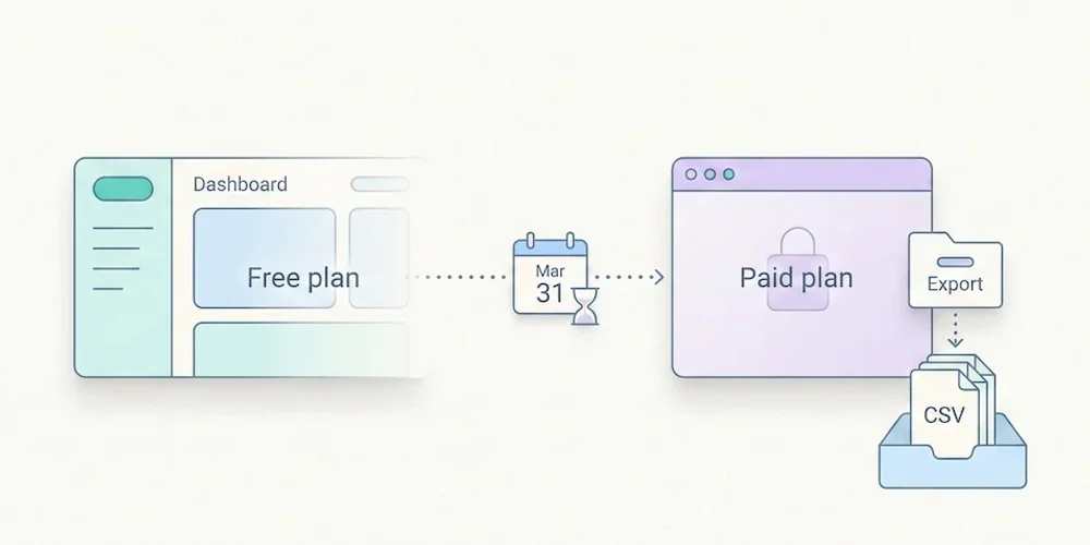
According to Piwik PRO's July 2025 announcement, the economics of the Core offer changed and Business and Enterprise became the paid routes highlighted for hosted professional use. For teams that adopted Core because it was free, the right response is not panic. It is a structured migration review. As of May 9, 2026, buyers should verify current pricing and terms on Piwik PRO's official pages before making a decision. Vendor pricing changes quickly, and analytics migrations are expensive when they are rushed. The decision is about ownership, not only price The repositioning of a generous free analytics tier forces a useful question: what are you actually paying for? If Piwik PRO remains the right product, the budget may be justified by governance, support, hosted infrastructure, retention and enterprise controls. If the team mainly needs readable traffic reporting, a lighter privacy-first SaaS or a self-hosted tool may be a better fit. The mistake is to compare only monthly list prices. The real cost includes setup, data retention, access management, documentation, legal review, reporting adoption and the effort required to explain the dashboard to non-specialists. Migration checklist Before changing tools, export and document:current sites, domains and tracking snippets; retention settings and historical data that must be preserved; dashboards or reports used by leadership, clients or marketing; goals, events and campaign parameters that are still useful; data-processing agreements and provider roles; access rights and users who must be migrated; privacy-policy wording and internal records of processing; the date when old and new tools will run in parallel.Run both tools side by side for a short period when possible. This gives the team a bridge for trend comparison and avoids treating a tool migration as a sudden drop in traffic. How to compare alternatives For a European SME, B2B SaaS or multi-site digital team, use five criteria:Does the tool answer the questions the team actually asks every week? Does the collection model separate minimal analytics from enriched tracking? Are pricing, retention and user limits easy to understand? Can non-specialists read the reports without training? Is the privacy documentation specific enough for your legal review?Plausible, Fathom, Simple Analytics, Matomo and Pomelo can all be reasonable depending on the answer. The best choice is the one that matches your operating model, not the one with the loudest comparison table. Where Pomelo fits Pomelo's intended launch position is narrower and clearer: cookieless by default, Strict first, Extended by explicit configuration, and dashboards designed for teams that need actionable reporting rather than analytics administration. That does not make it a universal replacement for Piwik PRO. It makes it a good candidate when the team wants minimal collection, multi-site readability and a product that documents the difference between baseline and enriched data. Sources Sources checked on May 9, 2026.Piwik PRO, Introducing the new Piwik PRO Core and updated pricing, July 3, 2025 Piwik PRO, Business plan Piwik PRO, Pricing Matomo, Pricing Plausible, subscription plans
- 09 Mar, 2026
Is free analytics still viable in 2026? The real cost of privacy-first freemium
For a long time, the promise sounded simple: web analytics could be free. Install a script, open a dashboard, and start measuring traffic. In 2026, that promise still exists, but it no longer means the same thing across the market. One recent signal made that especially visible: Piwik PRO ended its free Core plan and now presents its Business plan starting at €35 per month. At the same time, other vendors are taking different paths. Simple Analytics now highlights a limited free plan, Plausible still makes free self-hosting available through Community Edition, Matomo keeps its on-premise core free to download, and Fathom takes the most direct route: free trial first, paid subscription after that. So the useful question is no longer whether a vendor puts the word free on its pricing page. The useful question is this: free from what, and under which conditions? With analytics, you almost always pay somewhere. If not in subscription fees, then in setup time, maintenance burden, governance complexity, compliance work, or dashboards that are technically available but barely used. For SMBs and lean digital teams, that hidden cost usually matters more than the headline price. This article offers a simple decision framework. The point is not to say that free analytics is dead. The point is to show when it is still a smart choice, when it turns into a false economy, and why a product’s business model has become part of the product itself. In 2026, "free" covers at least four different models The main problem with the phrase free analytics is that it lumps together models that are economically very different. 1. Free analytics funded by something else In this model, analytics is not really the primary product you are paying for. It may be funded by a broader platform, another revenue stream, a growth strategy, or a larger ecosystem. For the buyer, the upside is obvious. Entry feels frictionless. The downside is that the cost often reappears somewhere else: heavier tooling, more operational dependency, more configuration work, or extra legal complexity when the processing goes beyond strict audience measurement. This is where the CNIL’s position is useful. The French regulator explicitly notes that some analytics offers fall outside the exemption perimeter when providers reuse data for their own purposes. In other words, a tool can look cheap or free at purchase time and become more expensive later if its purposes need tighter legal framing. 2. Limited freemium Freemium means durable free access, but with clear limits. The free plan gets you in the door, while monetization happens through volume, number of sites, users, retention, exports, API access, or collaboration features. In 2026, this is a more credible model than the old “very generous free plan for almost everyone” playbook. It is easier to read. The vendor is effectively saying: the basics stay accessible, and growth pays for the product. Simple Analytics now presents exactly that kind of structure. Its pricing page offers a 14-day full-feature trial and then the option to move either to a paid plan or to a free plan, depending on usage. The real signal here is not just price. It is whether the limits make sense. Healthy freemium nudges you to upgrade because your needs expand. Toxic freemium nudges you to upgrade because the free tier is intentionally frustrating. 3. Open-source, self-hosted analytics This is the classic “free, but” category. There is no software license to pay. Matomo Core remains free to download and use on your own infrastructure. Plausible Community Edition can still be self-hosted for free. Umami also continues to frame self-hosting as always free. On paper, this is attractive. You keep control, you choose the infrastructure, and you avoid recurring vendor fees. In practice, the cost moves rather than disappears. You need servers, backups, updates, monitoring, at least basic security hygiene, and someone who knows what to do when something breaks. Plausible is unusually explicit about this on its self-hosting page: you do not pay them, but you still pay for servers, CDN, backups, and infrastructure, and premium support is not included. For a technical team with existing infrastructure habits, that trade-off can be perfectly rational. For a non-technical SMB, the “free” label can be misleading. 4. Free trial, then paid subscription This is the cleanest model. You try the product for a short period, then you pay if you want to keep using it. Plausible offers a 30-day free trial with no credit card and starts at $9 per month on Starter. Fathom also leads with a 30-day free trial and then starts at $15 per month. Piwik PRO now presents a 30-day trial on its Business plan, starting at €35 per month. Prices and offers were checked on public vendor pages on May 9, 2026. They can change, so verify the official pages before buying. The advantage is clarity. The vendor is not pretending that the service can remain free for every serious use case. It is simply giving you time to validate the fit. For many buyers, that is healthier than a permanently ambiguous free tier. The real cost of analytics is rarely the entry price When a team says “we want a free tool,” it usually means something else:we do not want to make the stack heavier; we do not want a six-week setup project; we do not want to pay for features nobody will open; we want a dashboard multiple people can understand; we want to reduce compliance work rather than move it elsewhere.That is why list price, on its own, is a weak buying criterion. Setup cost A free tool with a confusing model can still cost days of documentation, setup, checks, and internal alignment. That cost is rarely line-itemed, but it is real. Maintenance cost This is the most underestimated part of self-hosted analytics. Matomo itself notes that its on-premise version requires a web server, PHP, a MySQL or MariaDB database, and ongoing work around installation, security, updates, and maintenance. The absence of a license fee is real. The absence of operating cost is not. Governance cost A free tool may work fine for one person and start to break down as soon as multiple sites, multiple stakeholders, shared access, or client reporting enter the picture. Once analytics becomes a collective object, readability and collaboration stop being optional. Compliance cost This is where many comparisons become too loose. In 2025, the CNIL published a self-assessment tool to help vendors determine whether an analytics solution can fit within the limited audience-measurement perimeter. But it also states clearly that this tool is not meant to assess overall legal compliance. That matters because it avoids two common mistakes. The first is assuming that a tool is automatically cheaper overall because there is no license fee, even though it may require heavier legal review or stricter configuration. The second is assuming that cookieless or privacy-first positioning removes the need for governance and legal framing. That is not what the CNIL says. The cost of poor adoption There is one more cost that often stays invisible: the cost of keeping a free tool that nobody really uses. A dashboard that exists but is rarely consulted may be cheap on paper and expensive in missed decisions. If your team only opens analytics when there is a crisis, or if the tool takes more time to interpret than the actions it is supposed to support, the free label stops being decisive. The market is more mature, which means it is less naive about free The end of Piwik PRO’s free plan matters because it reveals a broader market truth. Privacy-first analytics is no longer just a philosophical alternative to Google Analytics. It is a category of products that has to fund hosting, support, security, UX, integrations, collaboration, and sometimes stricter enterprise or regulated-sector requirements. In other words, the more credible an analytics product becomes for real professional use, the more central its funding model becomes. That does not mean free plans are doomed. It means sustainable free plans need sustainable economics behind them. In 2026, three paths look structurally healthier than the old generous-free-for-everyone model:a limited free tier that monetizes growth; open-source software that is free to self-host while operating costs stay on the buyer side; a paid product with a free trial.The fragile path is the broad, feature-rich free plan with no obvious long-term funding logic. When free analytics still makes sense There is no need for overcorrection. Free analytics is still a smart option in several situations. Case 1: one simple site, one main reader, low organizational complexity For a brochure site, a small publication, a side project, or a very small company, a free or limited freemium tool may be enough for a long time. If the real need is to understand traffic sources, top pages, a few key conversions, and broad trends, there is no reason to pay too early. Case 2: real in-house technical autonomy If your team already knows how to run servers, maintain backups, handle updates, and monitor infrastructure, open-source self-hosting can be a rational choice. In that case, “free” is not naive. You know the operating cost exists, and you accept it because you control it. Case 3: shortlisting before a buying decision A good free trial also has real value. It lets the team validate readability, exports, reporting flow, and day-to-day usefulness before making a commitment. When free turns into a false economy The opposite signals are usually easy to spot. You manage multiple sites or multiple stakeholders As soon as analytics must be shared between marketing, leadership, product, agencies, or clients, the limits of “free first” show up much faster. The tool stops being a counter and becomes part of governance. Nobody wants to maintain the stack This is the cleanest self-hosting test. If nobody internally wants to own updates, security, backups, and incident response, then self-hosted free is probably the wrong economic choice. Your use case goes beyond strict audience measurement The CNIL’s framework is narrow by design. It is centered on audience measurement and closely related purposes. As soon as the conversation expands toward broader marketing measurement, acquisition analysis, or other forms of reuse, the legal and operational framing gets more complex. A cheap tool can still become expensive to govern properly. The tool creates more friction than clarity This is often the decisive one. If your team dreads the dashboard, cannot tell which numbers matter, or keeps rebuilding the same views elsewhere, then the real cost has already outgrown the subscription you were trying to avoid. A simple decision framework for 2026 To avoid abstract debates, use a practical rule. Choose limited freemium if you are a small organization with a simple site, straightforward needs, and a desire to get started quickly. Choose open-source self-hosting if you have genuine technical autonomy, a strong control requirement, and explicit acceptance of operating cost. Choose a simple paid SaaS if your main problem is not the license fee but lost time, poor dashboard adoption, and weak clarity across teams. Choose a larger and heavier platform only if you truly need its additional depth, not because the market has trained everyone to confuse complexity with seriousness. The key is to make the business model fit the actual use case. A tool becomes risky when the way it is funded no longer matches what you expect from it. What to keep in mind Free analytics is still viable in 2026, but only if we stop confusing free with simple, durable, or low-friction. The right buying question is no longer “which tool is cheapest?” It is:who really funds the product; where the cost moves if I do not pay a license fee; who will maintain, explain, and govern the tool; when the free model becomes a liability; whether the economics still make sense when traffic, team size, or compliance expectations grow.For many SMBs, the best choice is neither the richest platform nor the absolute cheapest one. It is the tool whose economics are the most honest relative to real usage. That is one reason privacy-first analytics keeps gaining ground. The strongest products in that segment are not trying to pretend everything should be free forever. They are trying to make measurement lighter, clearer, and more sustainable. If you are comparing analytics tools in 2026, compare business models as carefully as you compare features. FAQ Is a free analytics tool necessarily worse? No. It can be a very good fit when needs are simple, the team is small, and the limits of the free tier actually match the use case. The issue is not free itself. The issue is whether the real cost has merely been moved elsewhere. Is self-hosted analytics really free? It is free in licensing terms, not in operating terms. You still need hosting, backups, updates, security, monitoring, and technical time. For teams that already have those capabilities, that can still be efficient. For non-technical SMBs, not always. Does privacy-first analytics automatically remove compliance work? No. It can reduce compliance burden, but it does not remove the need to define purposes, configure the tool properly, inform users, and assess consent requirements where relevant. The CNIL clearly separates audience-measurement exemption analysis from broader compliance assessment. Why do so many analytics vendors move from generous free plans to paid models? Because professional analytics products still have to fund infrastructure, support, security, product development, and often collaboration features. When the monetization path behind a generous free plan is weak, vendors usually tighten the offer sooner or later. Which model is healthiest for an SMB? In many cases, limited freemium or a small paid SaaS is healthier than a complicated zero-cost setup. Those models tend to be more transparent, more stable, and easier to govern across a real team. Sources Sources checked on May 9, 2026.CNIL, Cookies and audience measurement solutions CNIL, audience-measurement self-assessment tool, July 2025 Simple Analytics, Pricing Plausible, Pricing Plausible, Self-hosted web analytics Matomo, Is Matomo truly free to use? Matomo, On-Premise user guide Fathom, Pricing and free trial Piwik PRO, Business plan Piwik PRO Community, Will the free Piwik PRO remain active after February 2026? Umami, Pricing